Roots — Forging a Scalable
Design System for a Global Sports Platform
How we proactively built a themable, multi-client design system from the ground up, enabling 40% faster design cycles and seamless onboarding for major clients like the Royal Belgian Football Association (RBFA).
My Role
Product Designer (Design Systems)
Timeline
3 Months (V1)
Team
3 Designers (2 Core, 1 Senior Reviewer)
Core Skills
Design Systems, UI/UX, Figma Variables, PrototypingExport to Sheets
Overview
The Challenge of a Blank Slate
For a new, ambitious product like the "Grassroots" platform, a blank slate is both an opportunity and a risk. The goal was massive: create a comprehensive sports management tool for countless community clubs. The risk? Without a system, every new feature would create inconsistency, slow down development, and accumulate design debt before we even launched.
Furthermore, we knew the platform needed to be a chameleon. It had to serve the core "Grassroots" brand but also be fully adaptable for major enterprise clients, each with their own unique brand identity.
Problem Statement:
How could we build a brand-new, complex SaaS platform from the ground up in a way that ensures long-term consistency, accelerates development, and allows for effortless rebranding for future enterprise clients?
Chapter 1:
Laying the Foundation for Scale
The solution was to think like architects, not just decorators. We needed to build a robust, scalable, and flexible design system—which we named "Roots"—before the first product feature was even finalized. Our work was guided by four core principles:
Scalability: Components must be reusable and adaptable for future, unknown use cases.
Themability: The system's identity (colors, fonts) must be changeable with minimal effort.
Efficiency: Drastically reduce the time and effort required to go from idea to high-fidelity design.
Consistency: Ensure a cohesive and predictable user experience across the entire platform.


The two-layer color token system was the key to themability. Primitive tokens defined the raw palette, while semantic tokens gave them purposeful roles
(e.g., color-background-brand), allowing us to swap themes at the system level.

A robust typographic scale provided clear hierarchy and ensured consistent brand voice across all touchpoints, essential for a multi-stakeholder platform.

Our responsive grid system ensured consistent, accessible layouts across mobile, tablet, and desktop, fundamental for the platform's diverse user base.
Chapter 2:
A Disciplined and Collaborative Workflow
Building a system requires a systematic process. As a core contributor on a lean, three-person team, my role was to design, document, and maintain a wide range of components.
To ensure quality, our process mirrored a professional engineering workflow. We designed every component in its own Figma branch, submitted it for senior review, and only merged it into the main library upon approval. This disciplined approach was crucial for maintaining the integrity of the system as it grew.
The Agent's Cockpit
The order detail page was designed to be the agent's single source of truth. They could see customer details, the exact items in the cart, and a log of all previous activities. Most importantly, the "Actions" panel allowed them to send recovery links via WhatsApp or SMS with a single click, directly from the app.
Chapter 3:
The System in Action — A Library of Solutions

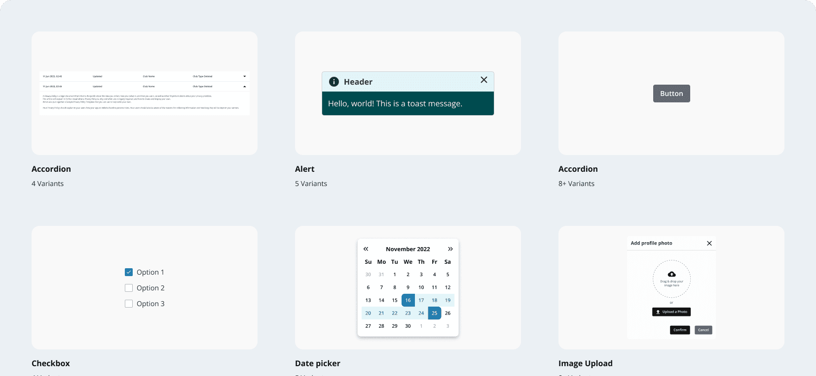
The Roots Design System provides a comprehensive library of over 40 components, ensuring a cohesive and intuitive user experience across the entire platform.
The Roots Design System grew to include over 40 components, covering everything from simple buttons to complex data tables. Each component was built with our foundational tokens, ensuring they were inherently themable and supported both Light and Dark modes out of the box—a critical feature for user accessibility and preference.


Every component was built with full support for both Light and Dark modes, a critical feature for user accessibility and preference.
Chapter 4:
Highlight — The Gradient Test
Our system's architecture was put to the ultimate test midway through the project.
The Twist: We had meticulously planned Unity with a clean aesthetic using solid colors. However, a major client, the RBFA, came on board with a brand identity that heavily featured gradients—a requirement that challenged our entire "flat" design foundation.
The Payoff: This is where our initial strategic decision to use Figma Variables and a two-layer token system paid off. We didn't have to manually update thousands of components. Instead, we created a new set of "gradient" styles and mapped them to our existing semantic tokens.
This proved the resilience of our architecture and allowed us to meet a critical business requirement without derailing the project, saving weeks of potential rework.
Chapter 5:
The Impact
The Roots Design System quickly became the backbone of product development at Orion, delivering measurable results.
Design Velocity
40% Reduction in Time for New Screens
Designers could focus on solving complex UX problems instead of recreating basic UI
Development Efficiency
Shipped New Features 25% Faster
Developers could build faster and more consistently by using the pre-built component library.
Client Onboarding
Enabled Seamless RBFA Integration
The themable architecture was a key factor in quickly and successfully onboarding a major client.
My Reflections & Key Learnings
Build the Scaffolding First: Investing time in a robust token architecture before building components is a superpower. It felt slow at first, but it saved us an incredible amount of time down the line.
Prepare for the Unknown: The "gradient challenge" taught me that a design system's true value is its ability to adapt to unexpected business needs. A scalable system is a future-proof one.
Process is Everything: A disciplined workflow (like our branch-and-review model) in a small team is just as important as in a large one. It builds good habits and ensures quality at scale.
Stakeholder Feedback
Jai Vignesh and Goldina Charmly didn't just build a component library; they built a scalable foundation for our entire product line. Their foresight with the token architecture and their disciplined Figma workflow was instrumental. When the RBFA's gradient requirement came in, we were prepared. That's the mark of a truly professional design operation.