Conscious Creative

HuzzleLabs — Crafting a Brand Identity for Trust and Affordability
How we developed a comprehensive brand identity and guidelines from the ground up, empowering a client-centered tech company to communicate its mission of quality and trust.
My Role
Brand Identity Designer
Client
HuzzleLabs
Collaborators
3 Designers
Core Skills
Brand Strategy, Logo Design, Visual Identity, Brand Guidelines
" width="178.00000370998913px"><path d="M 4.668 1.045 L 4.668 6.688 L 14.003 6.688 L 14.003 1.045 L 18.67 1.045 L 18.67 24.452 L 14.003 24.452 L 14.003 11.285 L 4.668 11.285 L 4.668 24.452 L 0 24.452 L 0 1.045 Z M 25.773 6.688 L 25.773 17.241 C 25.773 17.649 26.3 19.147 26.583 19.542 C 27.885 21.359 31.524 20.995 32.983 19.444 C 33.125 19.294 33.888 18.161 33.888 18.077 L 33.888 6.688 L 38.353 6.688 L 38.353 24.452 L 34.091 24.452 C 33.868 23.561 35.175 21.856 34.359 21.354 C 33.085 20.571 33.235 21.708 32.573 22.575 C 29.146 27.066 21.306 24.844 21.306 18.913 L 21.306 6.688 Z M 166.643 12.301 C 166.166 9.971 160.268 8.74 159.597 10.857 C 159.162 12.224 159.763 12.568 160.82 12.966 C 164.116 14.203 170.332 13.795 170.446 18.936 C 170.523 22.466 167.578 24.51 164.455 24.844 C 160.025 25.321 155.719 24.355 154.262 19.534 C 154.28 19.325 157.653 17.994 158.089 18.278 C 158.353 18.447 158.86 19.956 159.725 20.573 C 161.713 21.992 167.333 21.532 165.608 18.537 C 165.021 17.521 160.498 17.122 159.197 16.725 C 156.145 15.795 153.947 13.287 155.201 9.881 C 157.115 4.683 168.481 5.053 170.247 10.533 C 170.188 10.796 166.943 12.483 166.643 12.301 Z M 72.042 6.688 L 72.042 10.554 L 62.113 21.032 C 63.06 23.058 63.643 21.505 64.941 21.007 C 65.37 20.844 66.701 20.481 67.068 20.481 L 72.243 20.481 L 72.243 24.452 L 57.023 24.452 L 57.023 20.585 L 66.879 10.24 C 66.056 7.965 65.42 9.641 64.176 10.188 C 63.961 10.282 62.734 10.658 62.604 10.658 L 57.226 10.658 L 57.226 6.688 Z M 54.793 6.688 L 54.793 10.763 L 45.066 21.032 C 46.001 23.189 46.902 21.225 48.291 20.788 C 48.451 20.738 49.735 20.481 49.819 20.481 L 54.892 20.481 C 54.914 20.481 55.196 20.771 55.196 20.794 L 55.196 24.452 L 39.976 24.452 L 39.976 20.585 L 49.916 10.136 C 49.626 10.052 49.068 8.978 48.995 8.974 C 48.686 8.951 47.402 10.063 46.817 10.286 C 46.627 10.36 45.646 10.66 45.557 10.66 L 40.179 10.66 L 40.179 6.69 L 54.791 6.69 Z M 105.932 1.045 L 105.932 20.063 L 116.485 20.063 L 116.485 24.452 L 101.265 24.452 L 101.265 1.045 Z M 78.13 0 L 73.666 0 L 73.666 24.452 L 78.13 24.452 Z" fill="rgb(36, 128, 204)" height="24.95576075732436px" id="VyAnnDqev" width="170.4471521708732px"/><path d="M 69.813 7.024 C 67.376 5.758 63.696 5.958 61.712 8.038 C 61.024 8.759 60.659 10.485 59.49 9.085 C 59.047 8.554 59.883 7.524 60.105 6.8 C 60.182 6.55 60.5 5.448 60.5 5.327 L 60.5 0 L 56.036 0 L 56.036 24.452 L 59.891 24.452 C 59.768 23.82 58.95 22.422 59.063 21.868 C 59.096 21.708 60.161 21.267 60.372 21.298 C 60.496 21.317 61.399 22.987 61.821 23.402 C 63.893 25.446 67.786 25.271 70.178 23.862 C 75.586 20.677 75.402 9.929 69.811 7.022 Z M 69.119 17.967 C 67.711 22.257 61.29 21.739 60.547 18.029 C 60.385 17.221 60.397 13.73 60.596 12.949 C 60.916 11.693 62.477 10.502 63.694 10.288 C 68.411 9.465 70.487 13.802 69.119 17.965 Z M 13.73 19.434 C 10.665 22.065 5.109 21.962 4.693 17.137 L 17.884 17.137 C 17.859 15.879 17.823 14.383 17.592 13.154 C 15.733 3.323 1.2 4.111 0.082 14.163 C -1.083 24.644 10.406 28.341 16.855 21.601 L 14.527 18.8 C 13.914 18.64 14.052 19.158 13.732 19.434 Z M 13.419 13.793 L 4.693 13.793 C 4.989 8.564 12.934 8.52 13.419 13.793 Z M 53.446 21.264 C 52.74 20.518 53.773 12.278 52.464 9.634 C 49.69 4.027 38.121 5.48 37.366 12.328 C 38.214 12.217 41.286 13.386 41.735 12.752 C 41.867 12.566 41.879 11.998 42.066 11.632 C 43.314 9.185 47.863 9.085 48.48 11.856 C 48.541 12.134 48.616 12.953 48.501 13.139 C 48.316 13.436 42.79 14.41 41.83 14.732 C 38.766 15.76 36.562 18.249 37.674 21.733 C 38.989 25.854 45.438 25.919 47.48 22.431 C 47.989 21.559 47.618 21.101 49.14 21.317 C 48.836 24.907 52.391 25.501 55.025 24.454 L 55.025 21.319 C 54.53 21.342 53.862 21.701 53.45 21.267 Z M 47.054 20.531 C 45.42 21.607 41.57 21.921 41.83 19.143 C 42.064 16.644 46.729 16.585 48.525 16.092 C 48.547 18.119 48.89 19.321 47.054 20.533 Z M 94.391 20.481 L 98.246 20.481 L 98.246 24.452 L 94.391 24.452 Z" fill="rgb(36, 128, 204)" height="25.000000338616996px" id="ARndETUZt" transform="translate(79.754 0)" width="98.24628819485241px"/></g></svg>)
Overview
The Client's Dilemma
HuzzleLabs was founded with a powerful mission: to provide high-quality, affordable web solutions for small businesses, breaking the stereotype that professional service has to come with an exorbitant price tag. They were built on trust and transparency, but their brand didn't yet tell that story.
They faced a challenge common to many startups: a lack of a cohesive identity. This made it difficult to stand out in a competitive market and effectively communicate their core values to potential clients.
The Challenge:
To design a comprehensive brand identity that would embody HuzzleLabs' ethos of trust, quality, and affordability, and to create clear guidelines to ensure that identity remained consistent as the company grew.
Chapter 1:
Discovering the Brand's Soul
Before any design work began, we had to understand the "why" behind HuzzleLabs. Through a series of brand discovery workshops, we collaborated with their team to distill their values, goals, and personality.
This strategic foundation was crucial. We uncovered that the brand needed to feel friendly and approachable, yet professional and trustworthy. This led to the definition of their core Tone of Voice, which would guide all future communication.
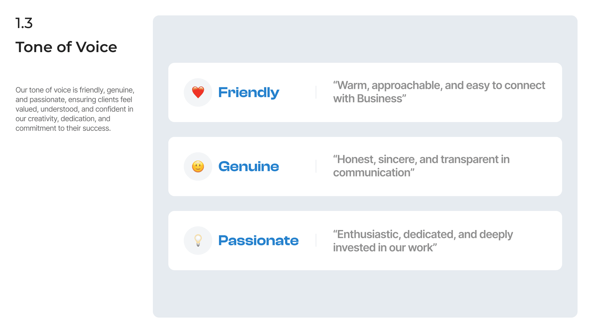
We defined three core pillars for the brand's voice—Friendly, Genuine, and Passionate—which became the north star for all visual and written design decisions.
Chapter 2:
Translating Values into Visuals
With a clear strategy, we began crafting the visual identity. Every design decision was a direct translation of the brand's core values of trust, professionalism, and clarity.
The Logo: A Symbol of Trust and Connection
The logo was designed to be more than just a name; it's a statement. The design symbolizes the connection HuzzleLabs builds with its clients, the reliability of their service, and their commitment to seeing projects through to completion.
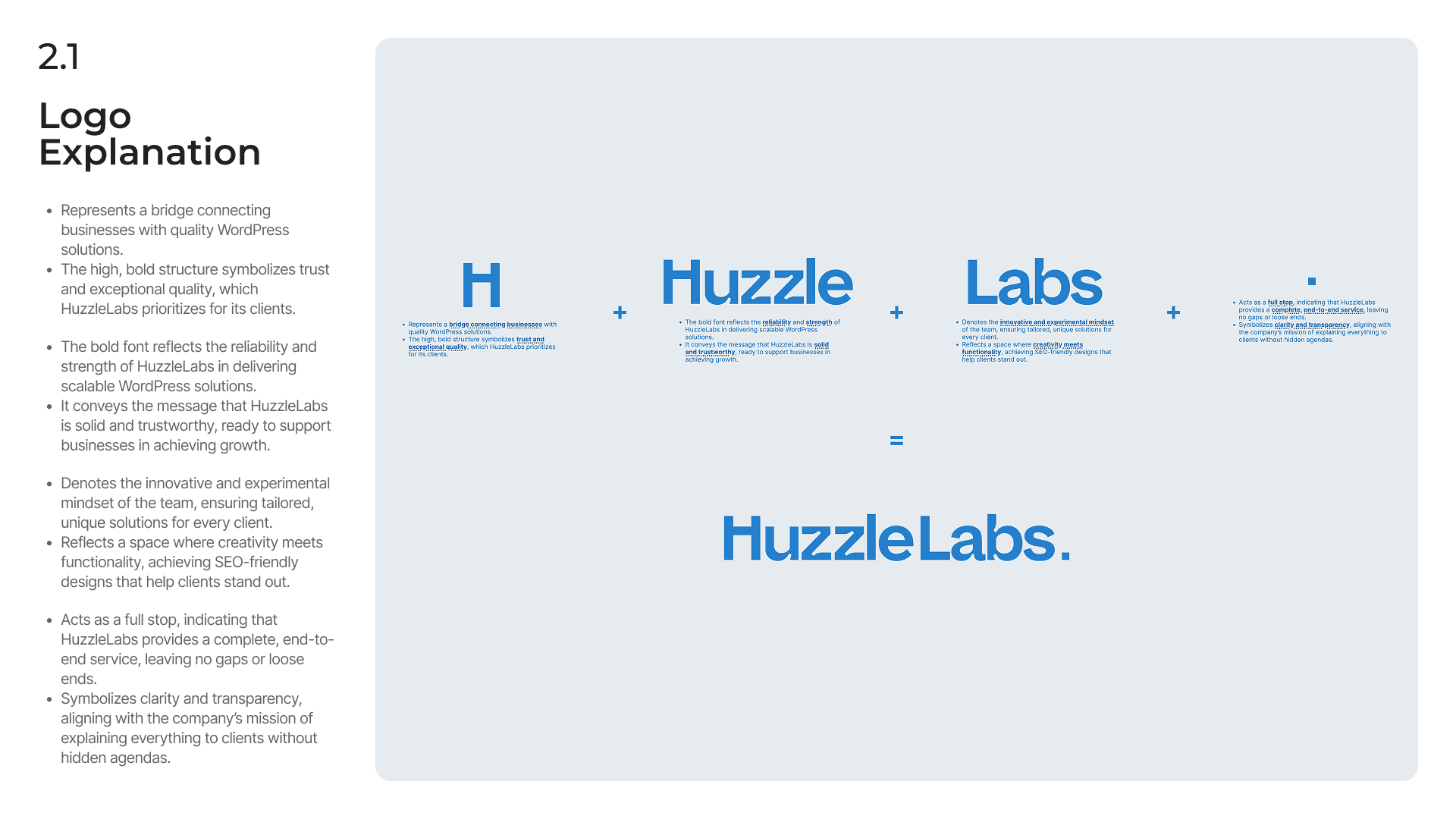
Each element of the logo was intentional. The "H" symbolizes a bridge to clients, the bold font conveys reliability, and the full stop signifies complete, end-to-end service.
The Color Palette: Professionalism Meets Approachability
Color plays a huge role in building trust. We chose a primary palette that felt stable, professional, and optimistic. The "Skystone" blue evokes feelings of trust and stability, while the clean neutrals provide a clear, no-nonsense foundation that speaks to the brand's transparency.
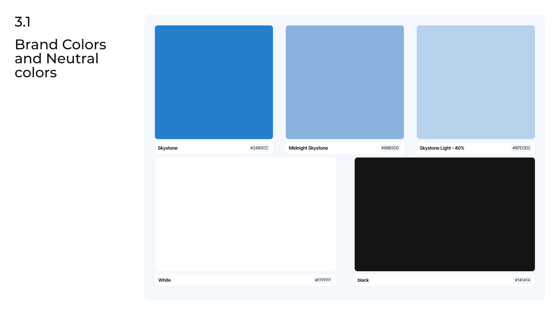
The brand's color palette was selected to be versatile and accessible, ensuring a professional and consistent look across both digital and print applications.
The Typography: Clarity and Modernity
The typography needed to be clean, modern, and highly legible, reflecting the brand's straightforward and honest approach. We selected Inter as the primary typeface for its exceptional readability on screens, and Montserrat as a secondary option for its clean, geometric feel in headings and displays.
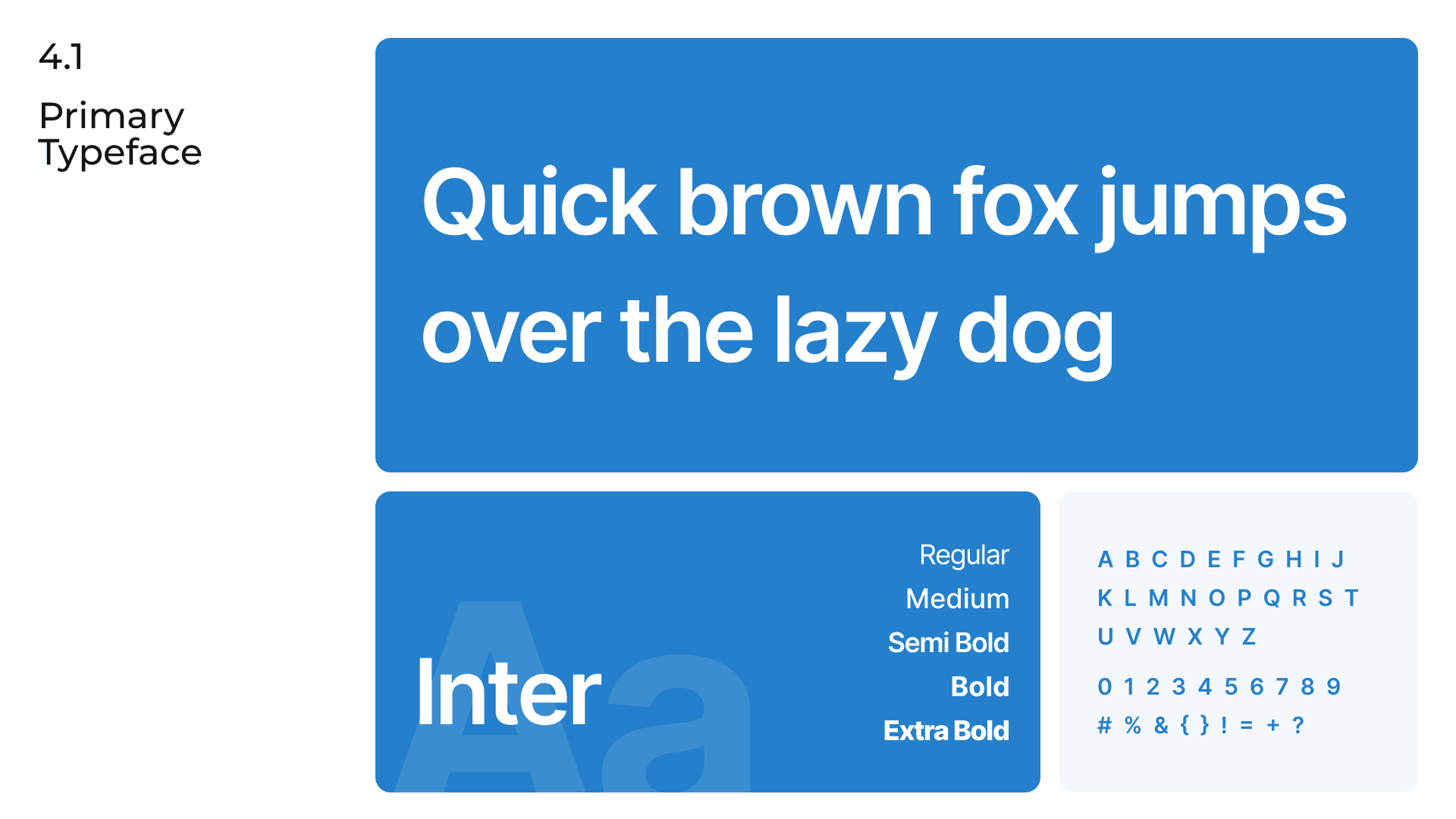
A combination of Inter and Montserrat creates a versatile and modern typographic system that is both professional and easy to read.
Chapter 3:
Building a System for Consistency
A brand identity is only effective if it's used correctly. The final and most critical deliverable was a comprehensive set of brand guidelines. This document empowers the HuzzleLabs team to be self-sufficient and maintain brand integrity across all touchpoints.
The guidelines covered every aspect of the brand's visual identity, providing clear, easy-to-follow rules for the team and future partners.
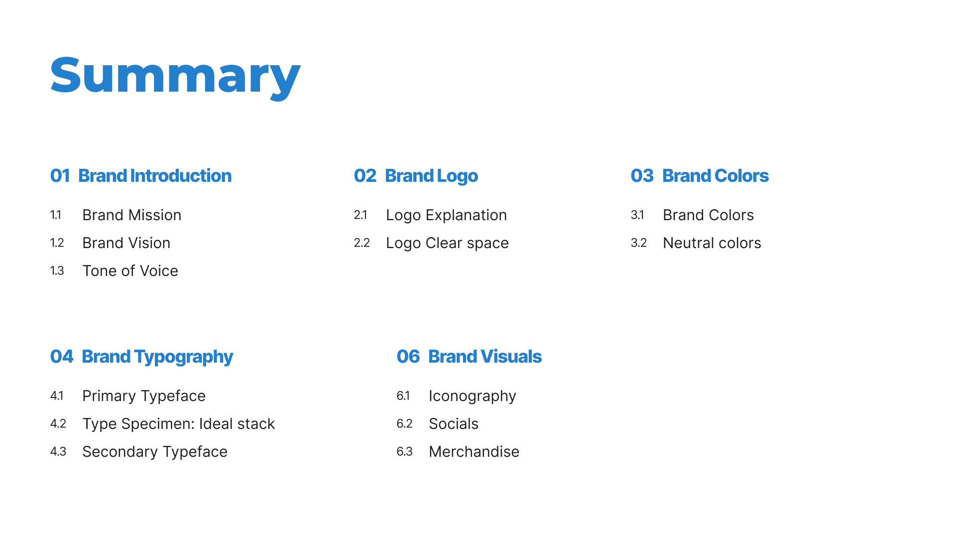
The brand guidelines were structured as a comprehensive, user-friendly document, covering everything from brand mission to merchandise visuals.
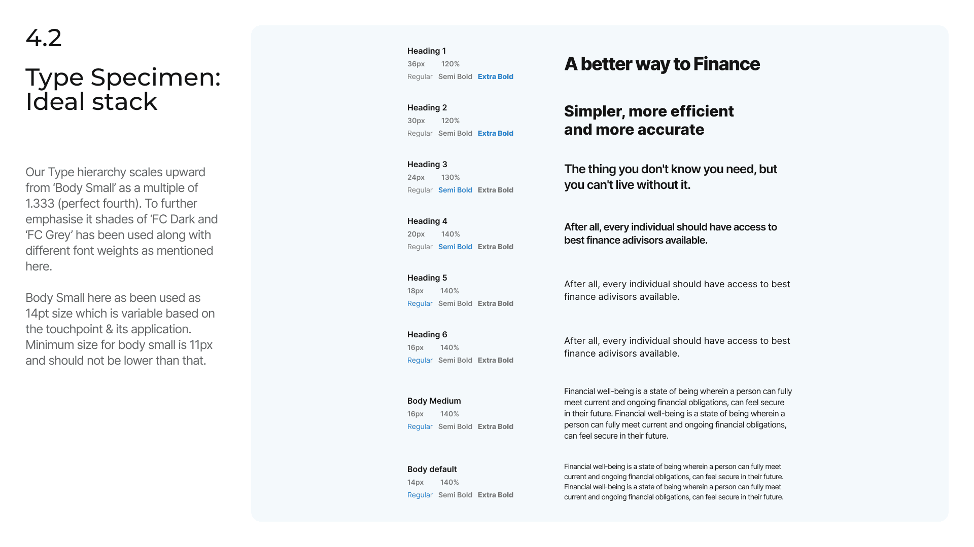
We provided a detailed type specimen and hierarchy, giving the HuzzleLabs team a clear and practical guide for applying typography consistently across their website and marketing materials.
Every component was built with full support for both Light and Dark modes, a critical feature for user accessibility and preference.
The Impact — The Brand in Action
The new brand identity gave HuzzleLabs the tools and the confidence to present themselves professionally in the market. The true success of the project is seeing the brand come to life, working seamlessly across a wide range of real-world applications.
Clarity and Confidence: The new identity effectively communicates their mission of trust and quality, helping them connect with their target audience of small businesses.
Consistency and Efficiency: The brand guidelines document became an invaluable internal tool, saving the team hours of guesswork and ensuring every touchpoint was professional and on-brand.
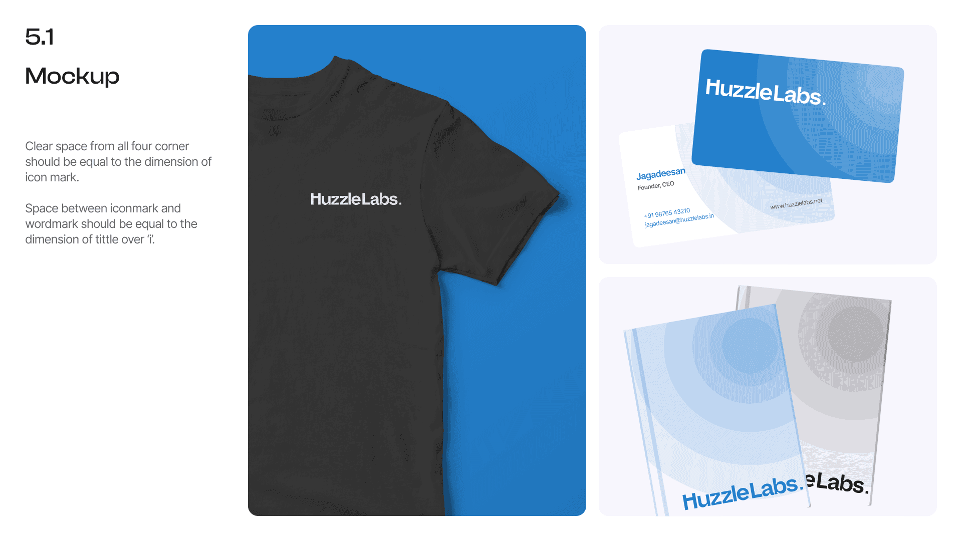
A Versatile Foundation: The identity proved to be flexible and adaptable, working equally well on a digital screen, a piece of merchandise, or a physical sign.
A combination of Inter and Montserrat creates a versatile and modern typographic system that is both professional and easy to read.